Logo Design
Logo Design
Logo Design
Logo Design
Logo Design
Logo Design
Logo Design
for @eastarchers
for @eastarchers
for @eastarchers
for @eastarchers
for @eastarchers
for @eastarchers
for @eastarchers
for @eastarchers


Out There Archery: Logo Evolution & Brand Identity Development
Client: East Archers
Location: South Africa
Location: South Africa
I was tasked with evolving and improving an existing archery brand logo, creating multiple concepts that maintained the essence of archery while elevating the professional presentation.
Design Evolution
Original Concept
- Circular emblem design
- Text-based border layout
- "Discover the world of archery" tagline
- Basic arrow and target motif
Design Exploration
Created multiple refined concepts:
- Minimalist Target Design
- Split circle motif
- Gold and silver color scheme
- Clean, modern typography
- Professional horizontal layout
- Grunge-Style Concept
- Hand-drawn arrow aesthetic
- Textured circular elements
- Dynamic composition
- Raw, authentic feel
- Abstract Archer Symbol
- Stylized human figure
- Integrated arrow element
- Turquoise and red accents
- Textured ring design
Final Design Elements
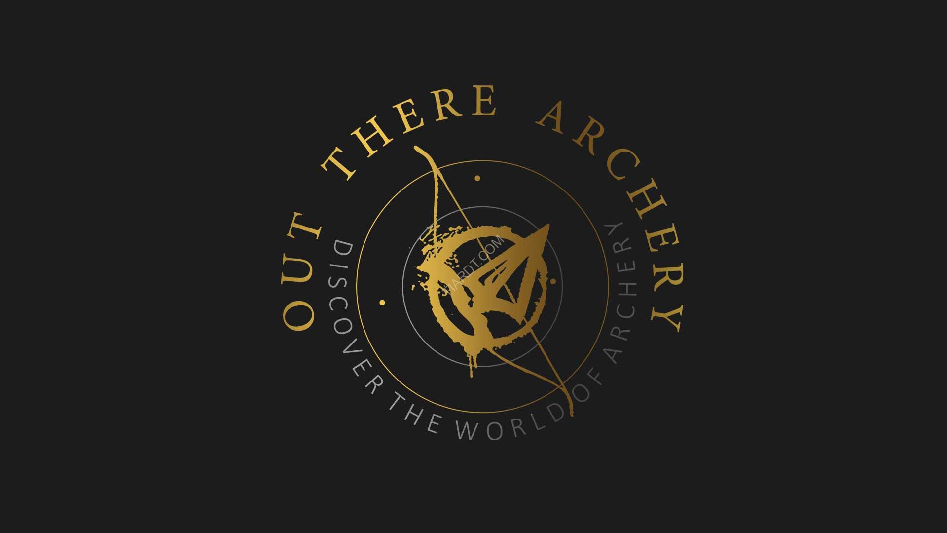
Chosen Concept (Hand-drawn Style)
- Distressed arrow through circular target
- Organic, authentic aesthetic
- Perfect blend of professional and approachable
- Dynamic movement in design
Typography
- Clean serif font for main text
- Elegant spacing
- Balanced hierarchy
- Professional presentation
Color Palette
- Primary: Gold/Black version
- Gold for premium feel
- Black for sophistication
- Grey accents for depth
- Alternative: Color version
- Turquoise outer ring
- Red inner ring
- White figure/arrow
- Silver accents
Technical Implementation
- Vector-based artwork
- Scalable design
- Multiple color variations
- Format versatility
Design Strategy
- Brand Positioning:
- Professional yet accessible
- Adventure-focused
- Educational emphasis
- Global perspective
- Visual Elements:
- Circular containment
- Dynamic arrow movement
- Balanced composition
- Textural details
Deliverables
- Multiple concept options
- Vector source files
- Color variations
- Style guide
- Application examples
Usage Specifications
- Primary logo lockup
- Secondary variations
- Minimum size requirements
- Color specifications
- Clear space guidelines
Project Impact
- Enhanced brand presence
- Maintained brand recognition
- Improved versatility
- Professional elevation
- Strong visual identity