Corporate Design
Corporate Design
Corporate Design
Corporate Design
Corporate Design
Corporate Design
Corporate Design
for @ATLAS
for @ATLAS
for @ATLAS
for @ATLAS
for @ATLAS
for @ATLAS
for @ATLAS
for @ATLAS


Atlas Hydroelectrics: Brand Identity Package Development
Client: ATLAS Hydroelectrics
Location: South Africa
Location: South Africa
I created a comprehensive brand identity package for Atlas Hydrodynamics, featuring a dynamic logo that represents fluid motion, accompanied by business cards with premium finishing and email signatures.
Logo Design Analysis
Visual Elements
- Symbol Design:
- Turbine/vortex-inspired circular motif
- Dynamic curved segments suggesting fluid movement
- Balanced symmetrical composition
- Smooth flowing lines representing liquid dynamics
- Turquoise accents adding depth and movement
- Typography:
- Strong, angular "ATLAS" wordmark
- Modern sans-serif for "HYDRODYNAMICS"
- Professional italic subtext "Fluid in motion"
- Gradient application in main text
- Strategic spacing and hierarchy
Color Palette
- Primary Colors:
- Deep teal/navy (#00454E)
- Bright turquoise (#20D5BB)
- Cool grey (#7A8589)
- Gradient Implementation:
- Smooth transitions between shades
- Strategic color placement
- Dynamic visual movement
Business Card Development
Premium Finishing
- Implemented Spot UV effect:
- A premium printing technique
- Creates glossy, raised elements
- Highlights specific design areas
- Adds tactile dimension
- Enhances visual appeal
Production Process
- Print Vendor Selection:
- Researched multiple vendors
- Compared quality samples
- Evaluated pricing options
- Considered location convenience
- Aligned with client budget
- Quality Control:
- Test print production
- Spot UV placement verification
- Color accuracy check
- Material quality assessment
Design Elements
- Custom factory silhouette
- Industry-specific imagery
- Strategic Spot UV placement
- Professional layout
- Contact information hierarchy
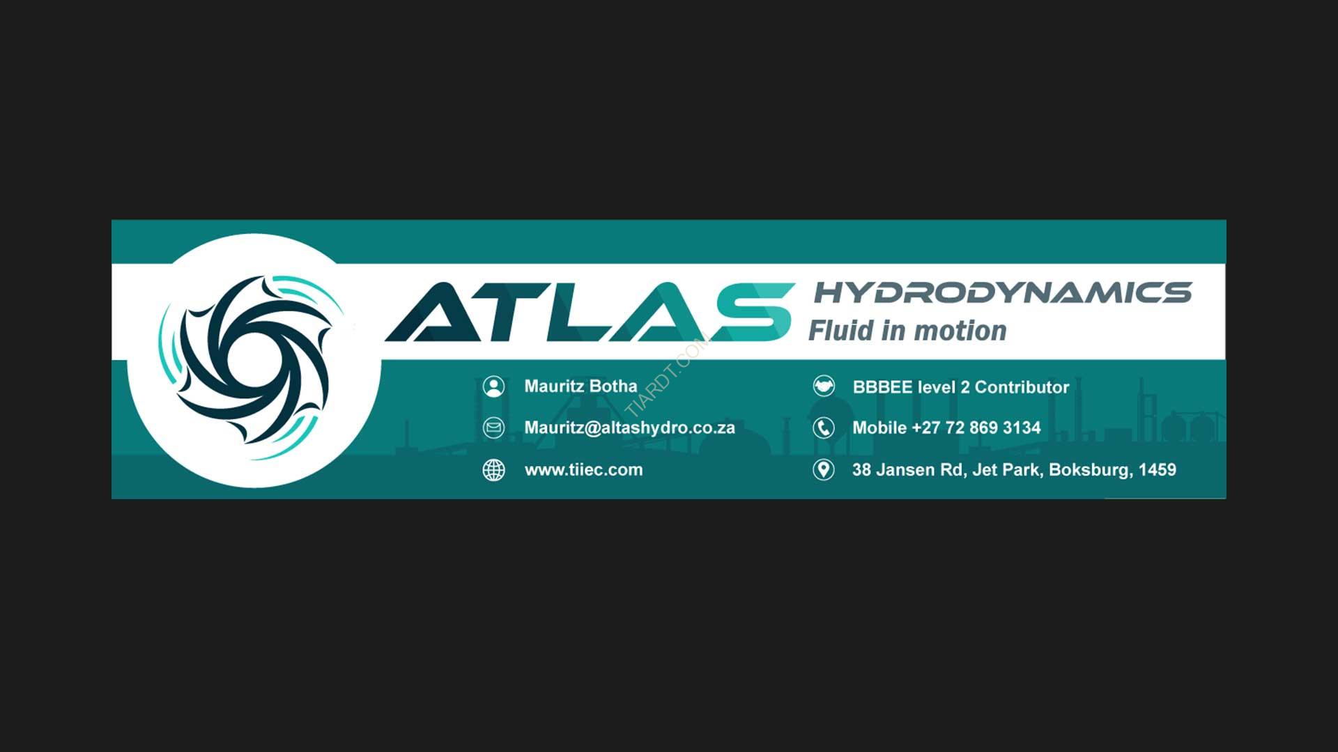
Email Signature Implementation
Visual Elements
- Symbol Design:
- Turbine/vortex-inspired circular motif
- Dynamic curved segments suggesting fluid movement
- Balanced symmetrical composition
- Smooth flowing lines representing liquid dynamics
- Turquoise accents adding depth and movement
- Typography:
- Strong, angular "ATLAS" wordmark
- Modern sans-serif for "HYDRODYNAMICS"
- Professional italic subtext "Fluid in motion"
- Gradient application in main text
- Strategic spacing and hierarchy
Color Palette
- Primary Colors:
- Deep teal/navy (#00454E)
- Bright turquoise (#20D5BB)
- Cool grey (#7A8589)
- Gradient Implementation:
- Smooth transitions between shades
- Strategic color placement
- Dynamic visual movement